The process of representing data using visual components like graphs, charts, and maps is known as data visualization. Transforming complicated dense or numerical data into a more easily interpreted visual representation. In addition, tools for data visualization enhance and automate the process of visual communication for precision and detail. So, from raw data you can derive actionable insights by utilizing the visual representations. Data visualization’s main objective is to make data easier to access and understand so that users can spot patterns, trends, and outliers more quickly. This holds especially significance when dealing with large datasets as the sheer amount of data can be debilitating in the absence of efficient visualization strategies. Hence, in this article we understand What is Data Visualization and its importance.
Why is Data Visualization important?
Data Visualization can assist in any industry or profession by providing information in the most effective manner. In the business intelligence process, data visualization certainly plays a vital role in transforming raw data into a model and presenting it to draw conclusions. Moreover, to better assemble crucial data into more comprehensible and interpretable visualizations, data scientists working in advanced analytics are developing machine learning algorithms. Data visualization in particular makes use of visual data to convey information quickly, effectively, and globally. Therefore, by using this technique, businesses can determine which aspects of their operations require improvement, what influences customer satisfaction and dissatisfaction, and how best to handle particular products (where to sell them and to whom). Moreover, Decision-makers, business owners, and stakeholders can more accurately forecast future growth and sales volumes with the use of visualized data.
- Helps discover trends in data: Finding trends in the data is what data visualization does most effectively. After all, visualizing all the data in front of you makes it much easier to spot trends than having the data in a table.
- Helps provide perspective on data: By displaying the significance of the data in relation to the bigger picture data visualization certainly offers a viewpoint on the data. Also, it shows where specific data references stand in relation to the whole data set.
- Helps put data in the correct context: Understanding the context of the data with data visualization is indeed not simple. Because context gives the entire circumstances of the data it is very hard to understand by simply looking at the numbers in a table.
- Helps save time: If you use data visualization instead of just looking at charts you can extract some insights from the data much more quickly.
- Helps tell a data story: Another way to tell viewers a data story is through data visualization. In fact, by telling a story and guiding the audience to an inevitable conclusion the visualization can be used to present the data facts in an understandable format. Hence, like any other story, this one about data should have a strong beginning, a simple plot and a conclusion that it is heading towards.
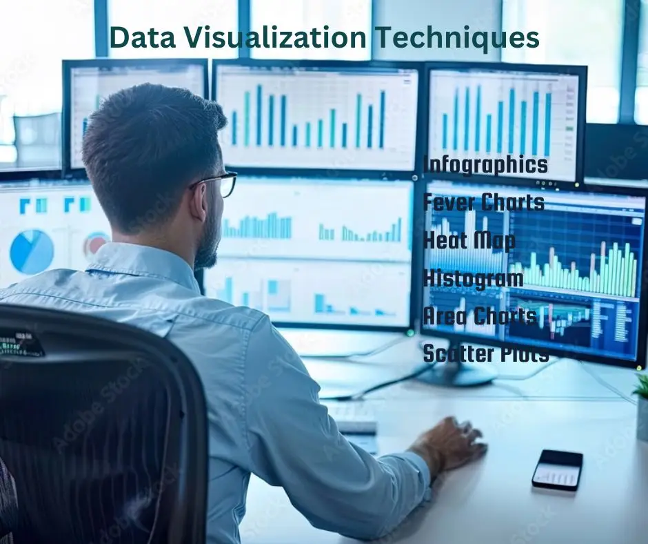
Data Visualization Techniques:
There are various ways to assemble information so that we can visualize the data. Further, various graphs and tables can be used to create an easily interpreted dashboard depending on the data being modeled and its intended use. There are automated and manually created visualizations. You can choose from a variety of types to satisfy your needs for visualization.
1. Infographics: Infographics as opposed to a single data visualization take a large amount of data and provide a thorough visual representation. An infographic is a great tool for examining difficult and highly subjective subjects.
2. Heatmap Visualization: This approach makes use of a graph to show whether a given set of numerical data points is high-value or low-value by highlighting the points in warm or light colors. Because studies have shown that people understand colors far better than they do numbers and letters, this data visualization technique aids the viewer psychologically in identifying the information.
3. Fever Charts: Changing data over time is displayed on a fever chart. As a marketing tool we could project the performance accurately for the upcoming year by comparing it to the previous year. This can facilitate decision-makers’ easy interpretation of a wide range of data sources.
4. Area Chart: The time-series relationship of the data is beautifully visualized with area charts. Area charts can be used to visualize a relationship such as the earnings for individual departments over a given period of time or the popularity of a product since the 1980s.
5. Histogram: Histograms measure frequencies as an alternative to examining trends over time. Basically, these graphs use an automated data visualization formula to display a range of easily interpretable values illustrating the distribution of numerical data.
6. Scatter Plots: These illustrations which are frequently employed in regression data analysis useful for revealing the relationship between two variables. These however can occasionally be mistaken for bubble charts which use the x- y- and bubble size to visualize three variables.
Data Visualization Tools
There has never been a simpler way to access data visualization tools. Libraries with open-source code like D3.js with the help of analysts can present data in an interactive manner and engage a wider audience with fresh information. Among the most widely used open-source visualization libraries are the following:
- D3.js: This JavaScript library works as a front-end to create dynamic and interactive data visualizations within web browsers. To create browser-friendly visual representations of data D3.js combines HTML CSS and SVG. Animation and interaction features are also included.
- E Charts: A powerful library for charts and visualizations that makes it simple to add charts to products, research papers, presentations, and other materials that are easy to use, interactive, and highly customizable. Echarts is based on JavaScript and ZRender, a lightweight canvas library.
- Vega: Vega describes itself as “visualization grammar”. It allows users to personalize visualizations over a vast array of web-accessible datasets. deck.gl:
- Deck.gl: It is a framework for exploratory data analysis on big data. It’s a component of Uber’s suite of open-source visualization frameworks. It contributes to the development of web-based, high-performance GPU-powered visualization.
Conclusion
The human brain cannot process and interpret such a large amount of raw disorganized data; therefore, Data Visualization is necessary. Therefore, to convey data findings and identify patterns and trends that will help us gain understanding and make better decisions more quickly graphs and charts are necessary. We should be surely aware of the value that data visualization brings to our business. These easy-to-use visualization tools and features can represent data in a meaningful and understandable way.
FAQs
Ans. The primary objective of Data Visualization is to easily recognize patterns, trends, and outliers in big data sets.
Ans. Business Analysts and Data Scientists collaborate to turn data insights into action. They create charts, graphs, and diagrams to illustrate trends and forecasts. When summarizing data, stakeholders are able to better comprehend and apply results.
Ans. Tools like Chartist, FusionCharts, Datawrapper, Infogram, Tableau, ChartBlocks, and Google Charts are a few.
Ans. In a number of sectors including marketing, e-commerce, government, finance, healthcare, and journalism data visualization abilities are highly recommended. Also, Effective data communication is a key component of these industries’ ability to generate insights, make wise decisions, and boost productivity.